A Place That Feels Like Home (But Much Better)
-
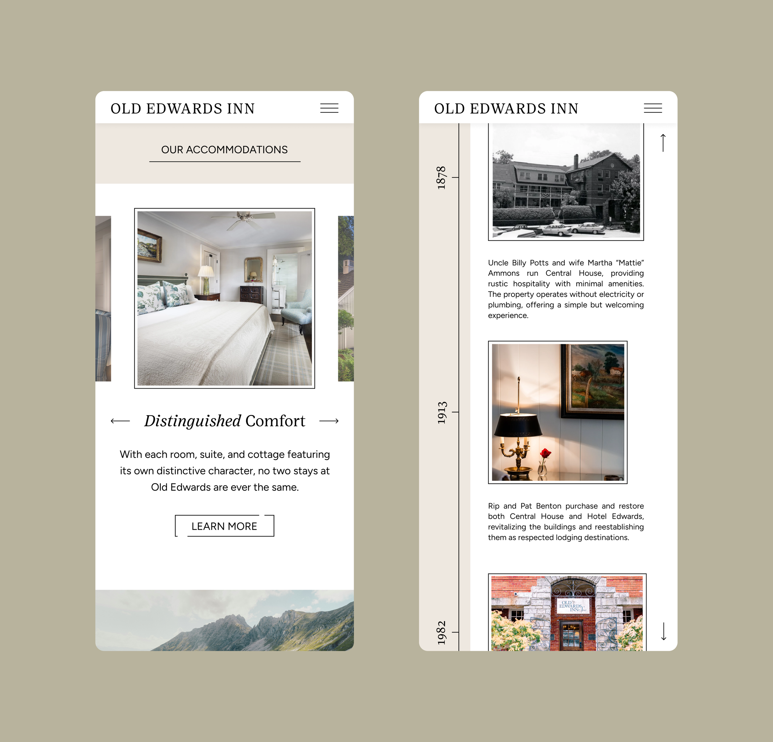
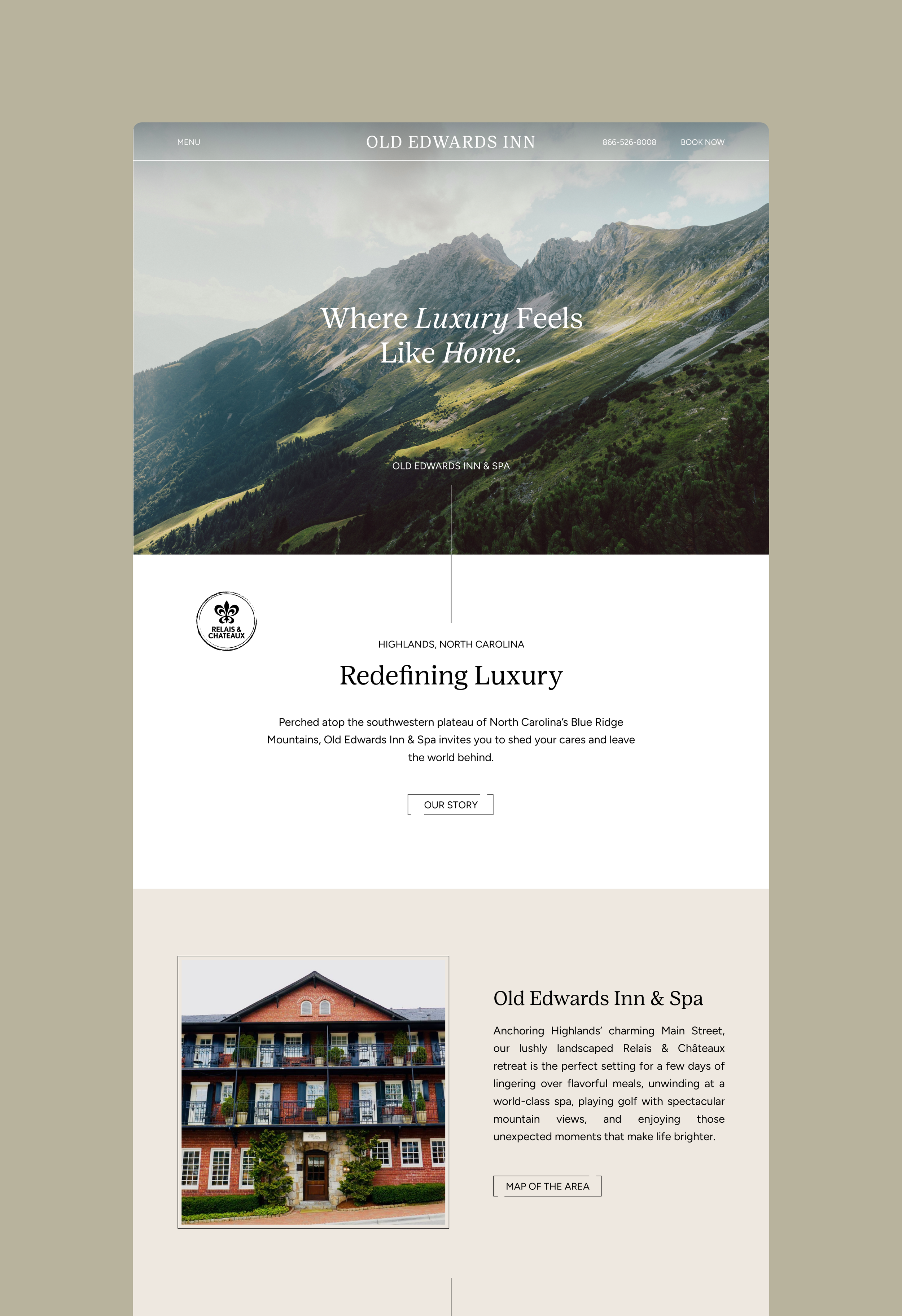
Founded in 1878, Old Edwards is nearly synonymous with Highlands itself. Over time, it has become a destination for rest, retreat, and reconnection with nature. For this project, I set out to reimagine Old Edwards’ visual identity—honoring its long-standing legacy while better aligning the brand with the refined, experience-driven clientele it serves today.
Honoring the Past, Designing for the Present
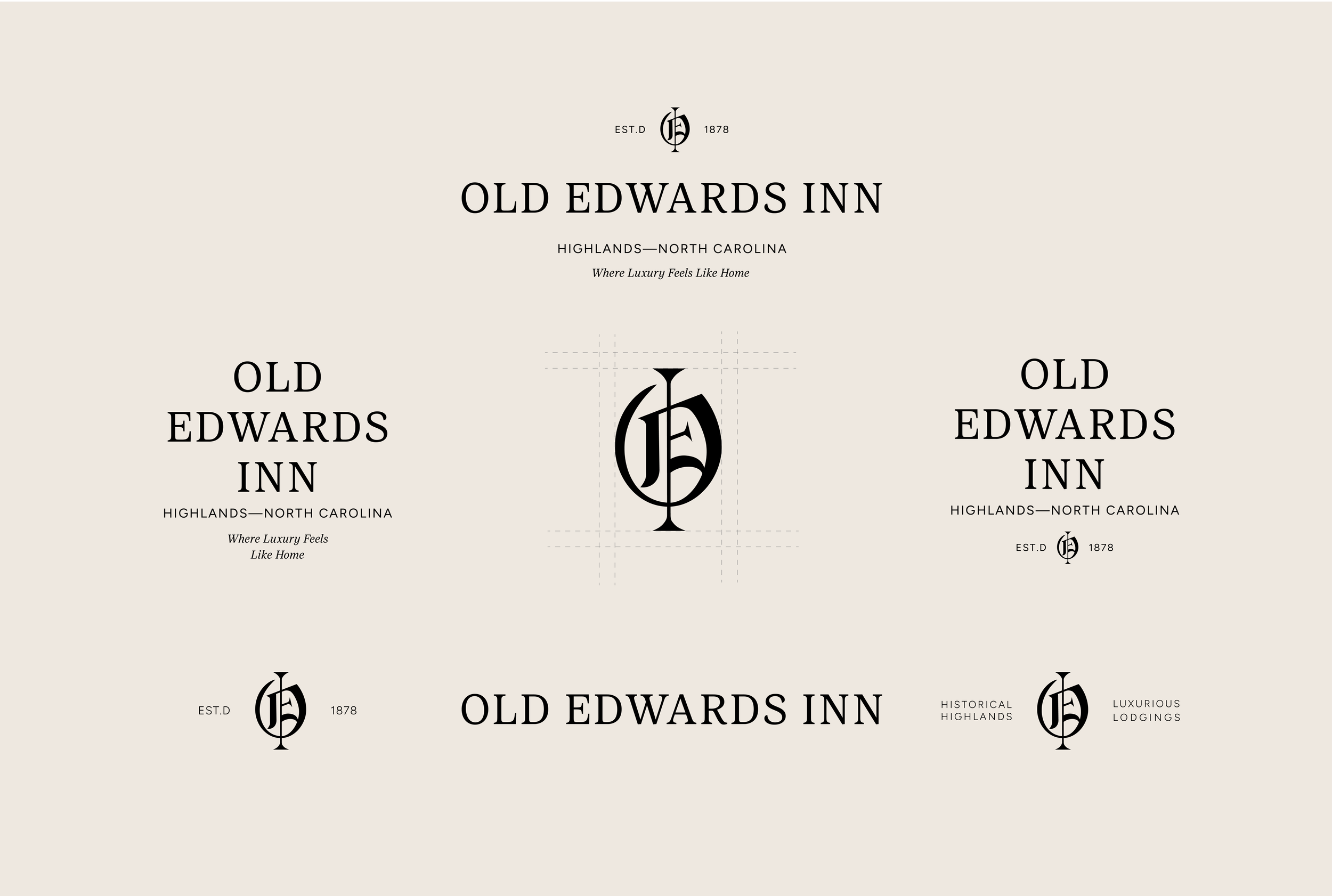
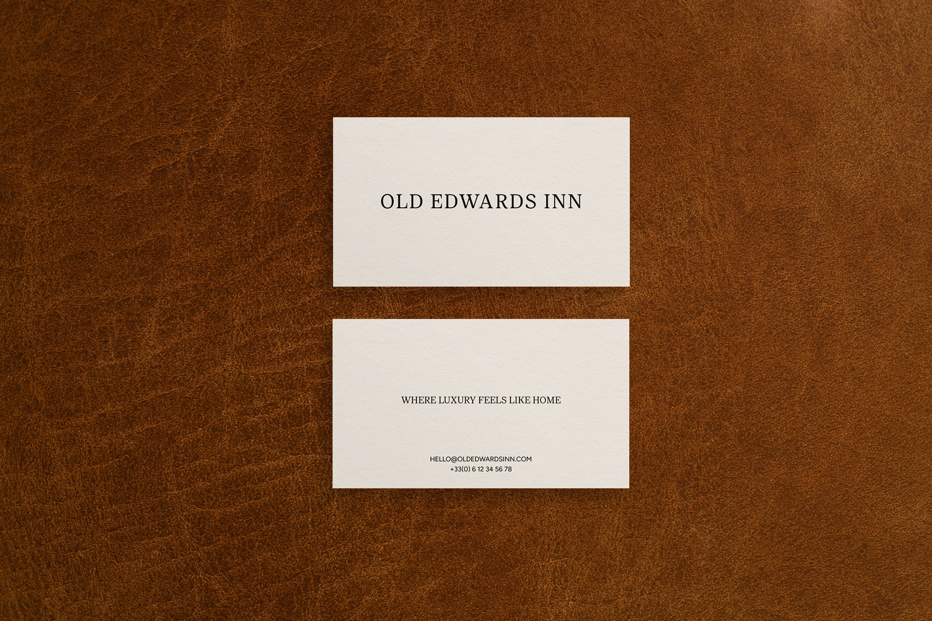
Beginning with the logo, my goal was to bridge Old Edwards’ historic roots with its modern offerings. I paired a welcoming yet refined serif with a clean sans serif to introduce a contemporary edge while maintaining an air of quiet luxury.
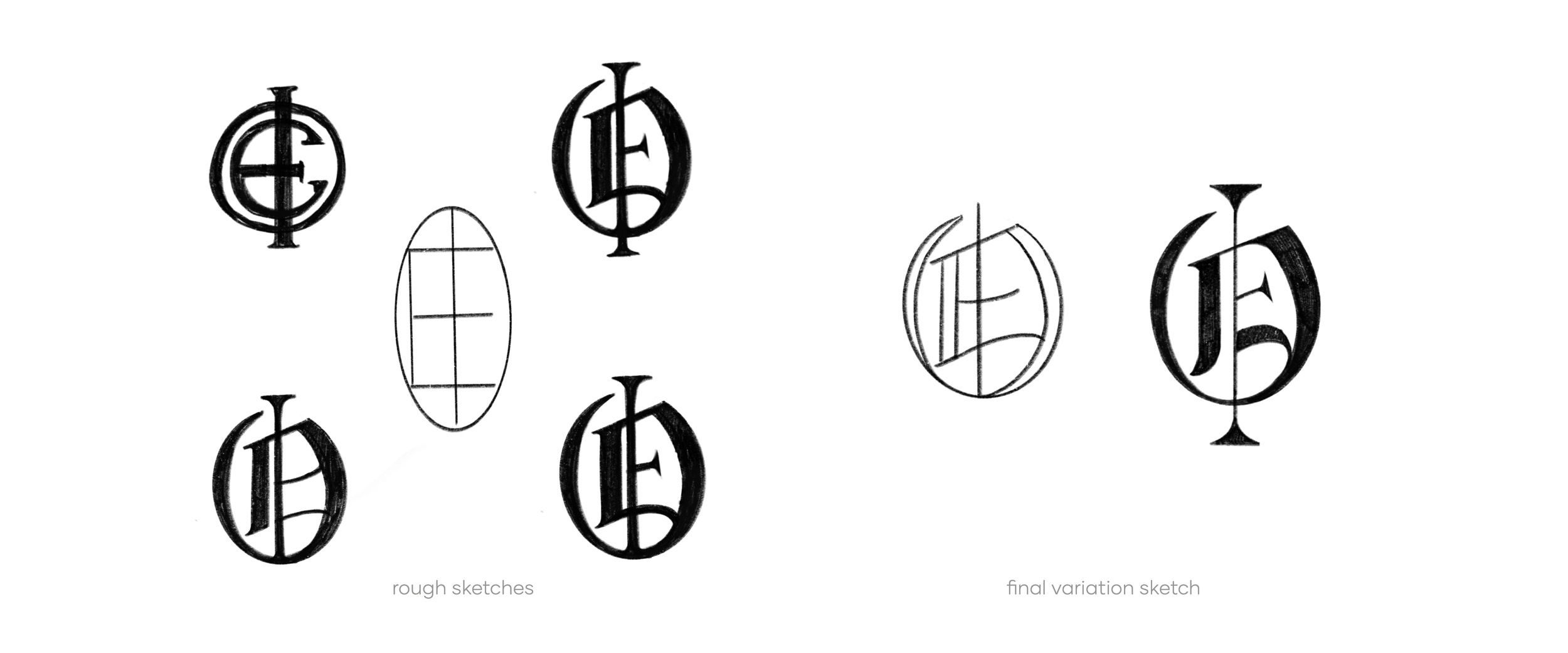
For the primary letterform, I drew inspiration from Old English typography as a nod to the Inn’s European influence and longevity. Just as these letterforms have evolved over centuries, Old Edwards has adapted with time while remaining true to its purpose of hospitality. Within the “O,” I subtly incorporated the letters “E” and “I,” creating a mark that feels layered, intentional, and timeless.
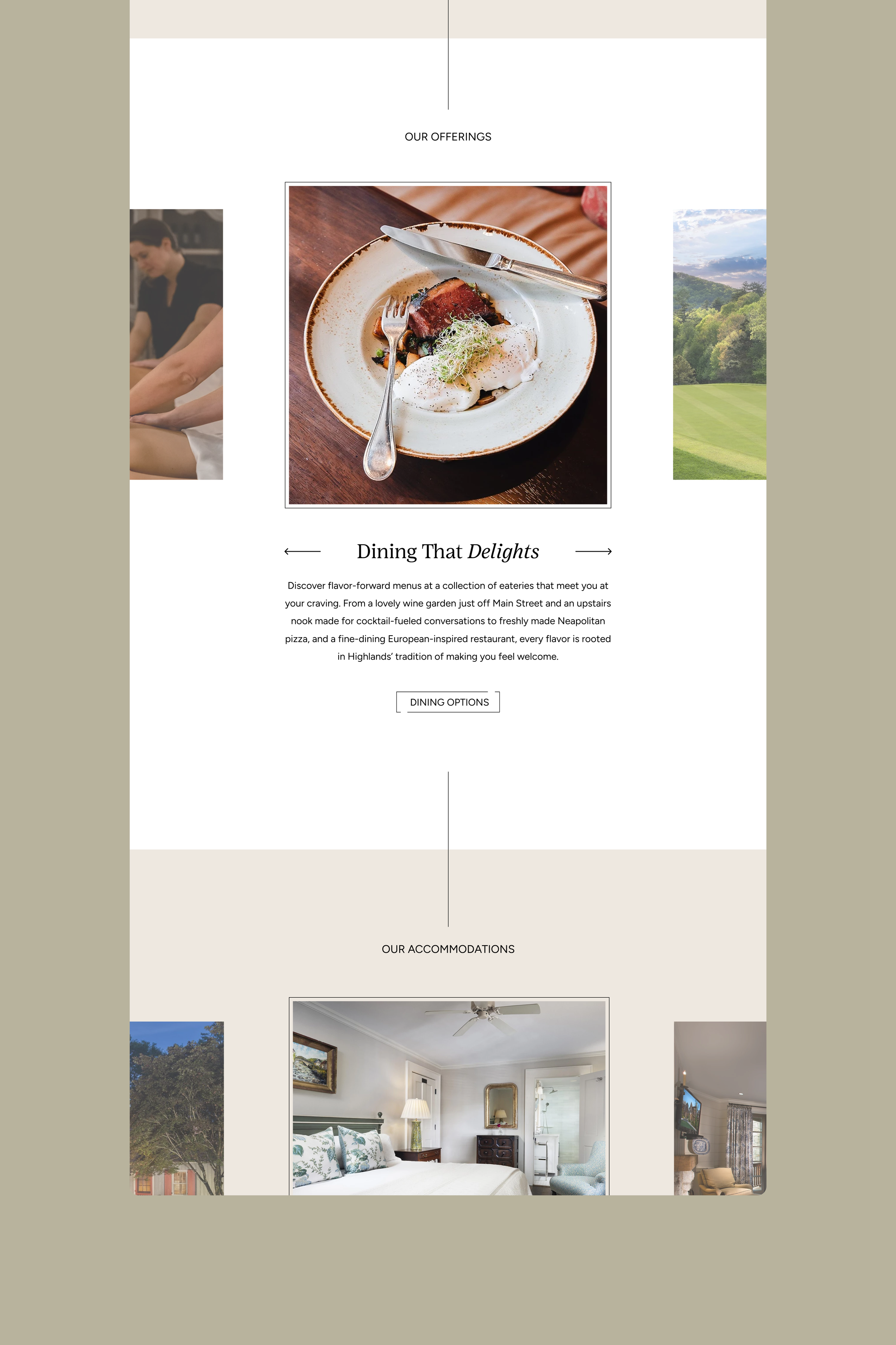
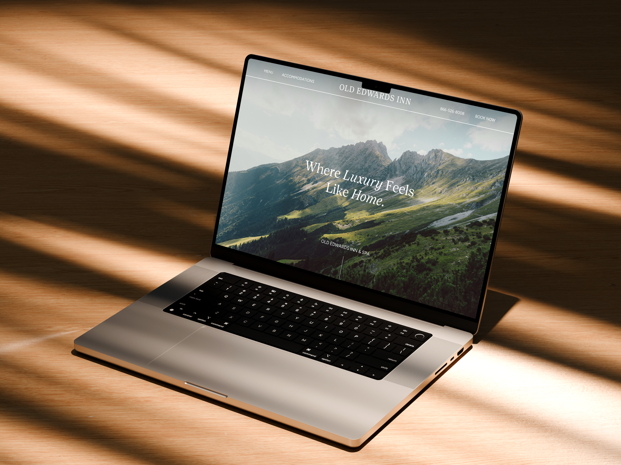
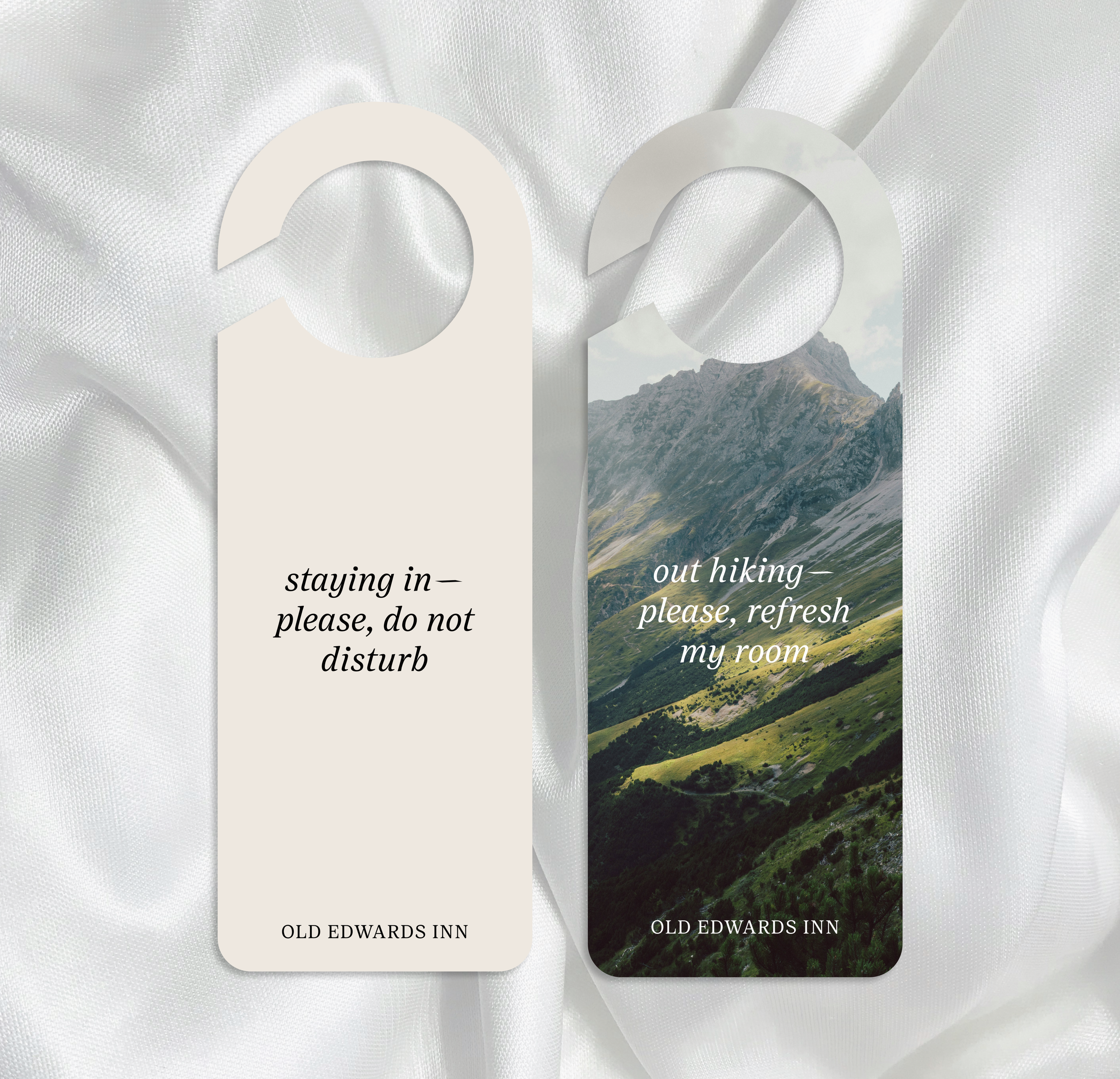
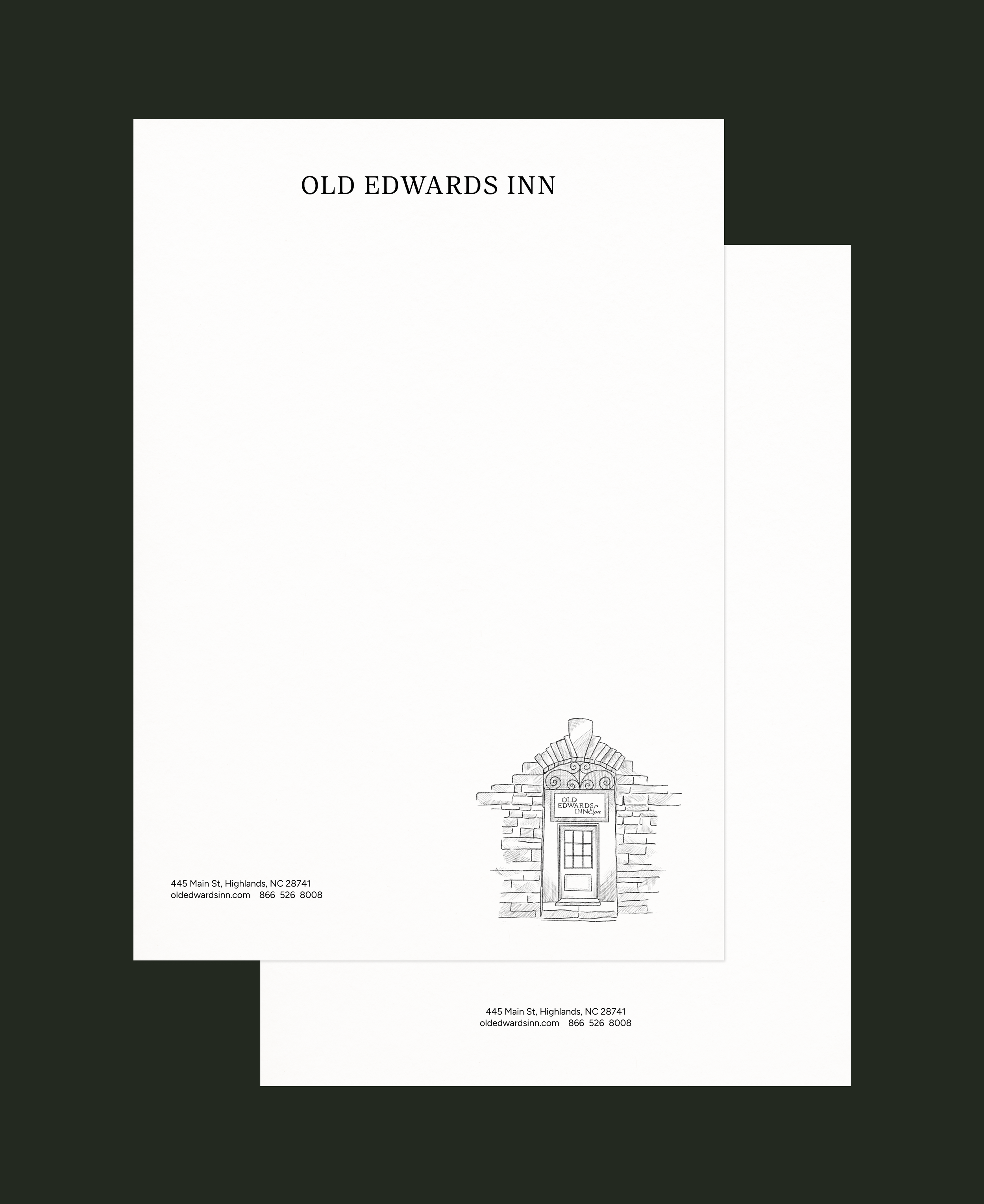
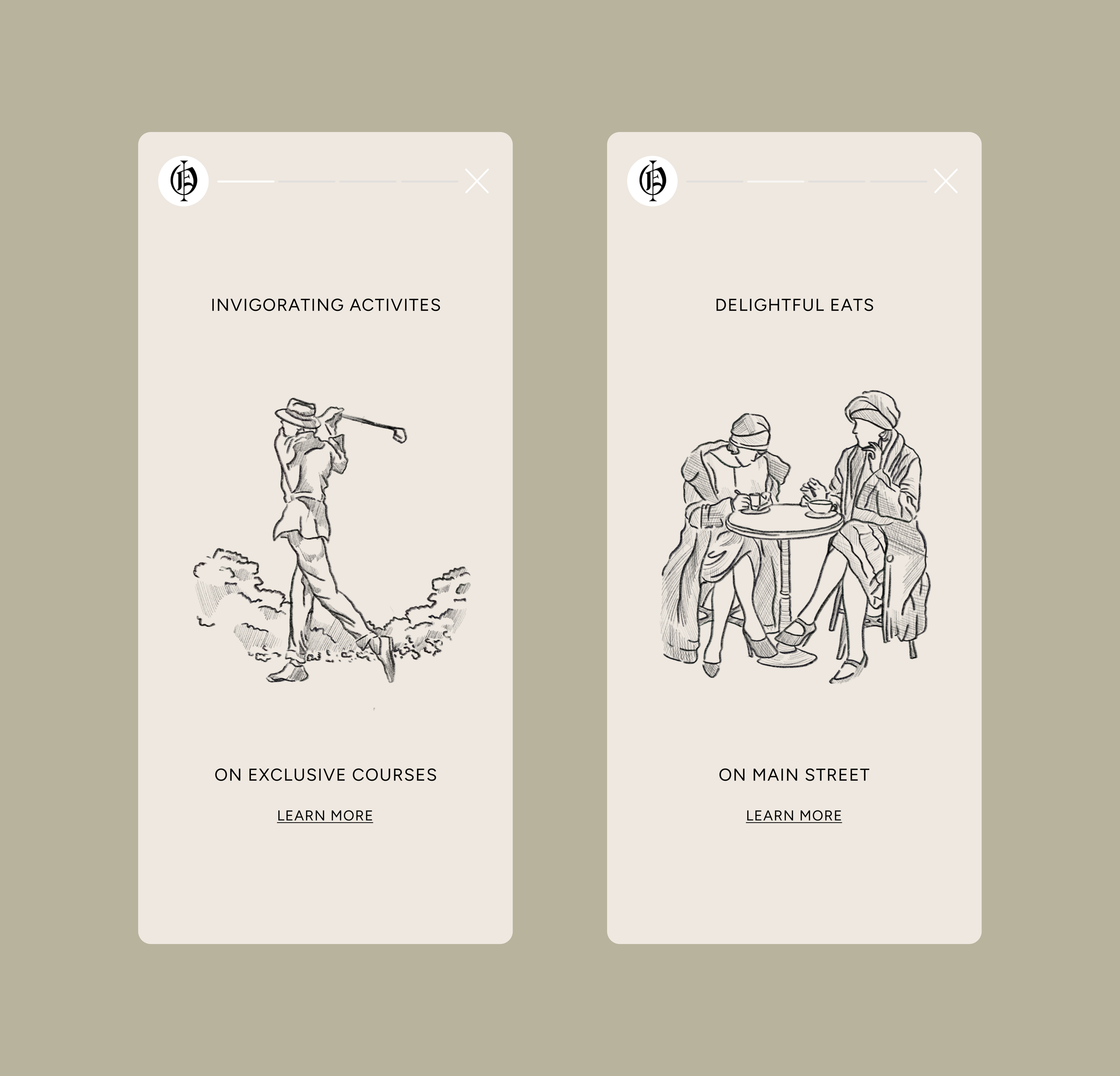
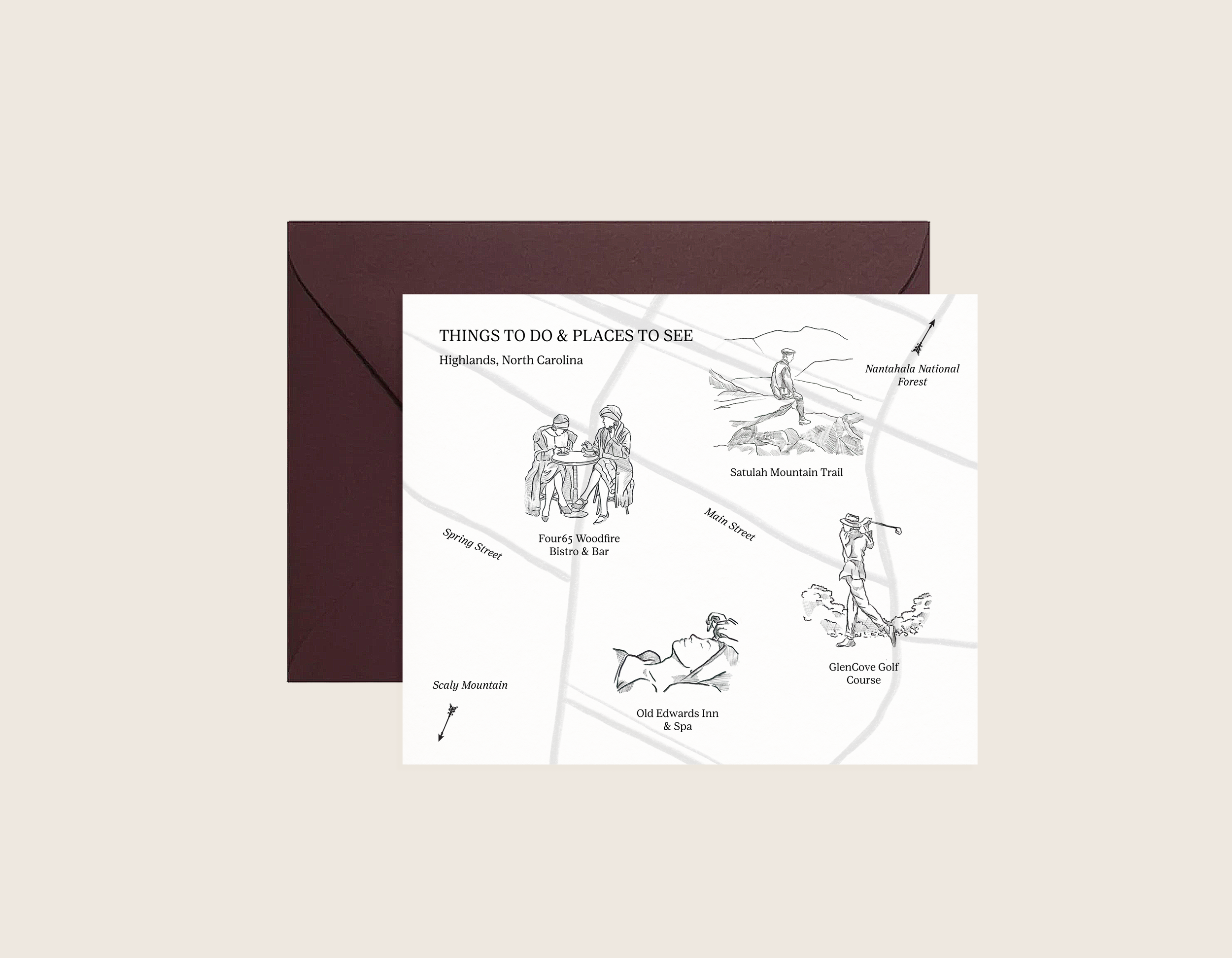
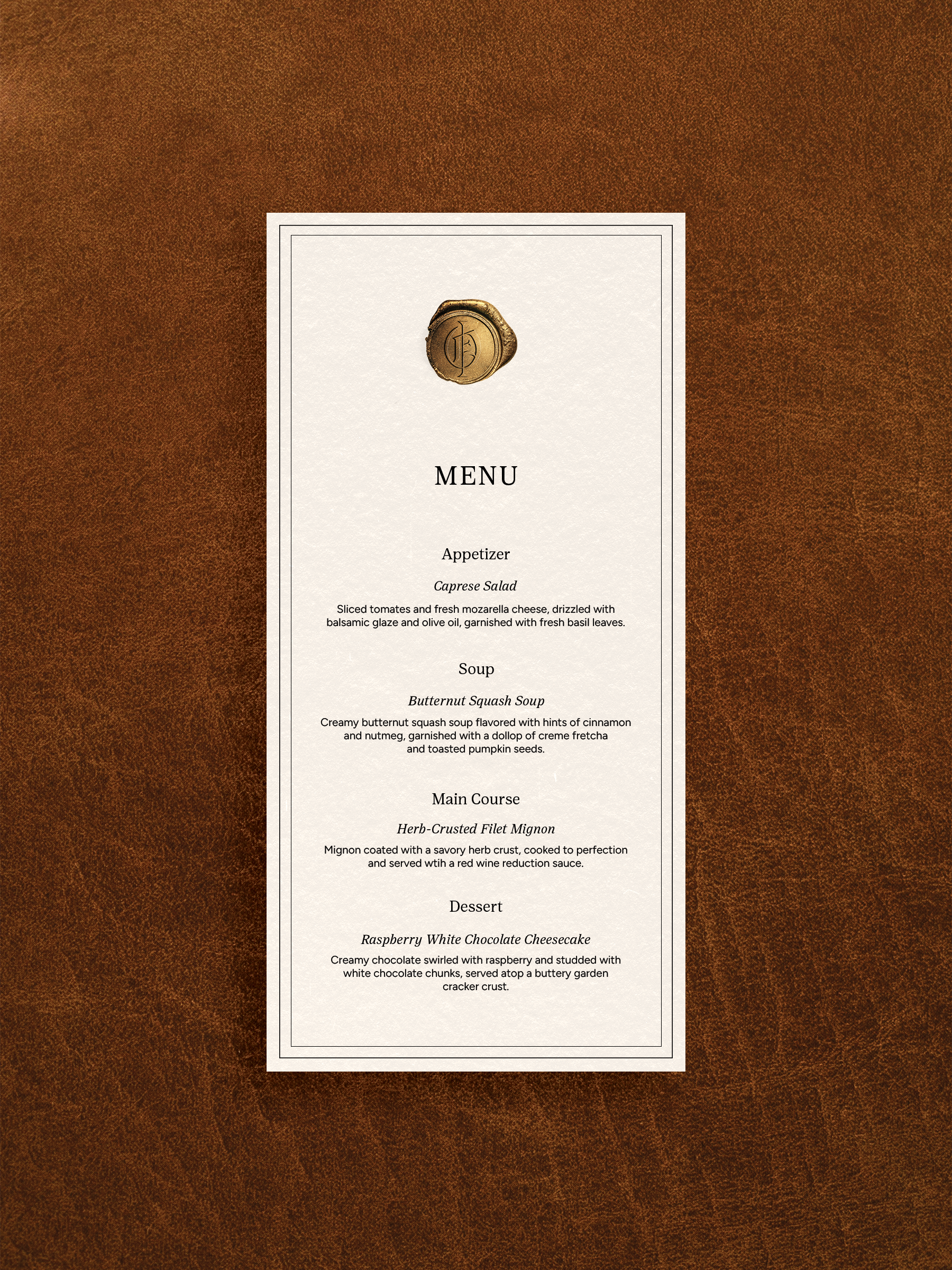
With a strong brand voice already in place, I focused the remainder of the project on refreshing the website experience. I streamlined layouts, improved legibility, and introduced more space throughout—aiming to mirror the in-person experience: calm, restorative, and user-centered. Hand-drawn sketches are incorporated throughout the project to bring a human, tactile quality to both the physical and digital touchpoints.
This project demonstrates how a historic hospitality brand can evolve visually while preserving the warmth, care, and sense of home that define it.