And I Had to Ask Myself—How Can I Make This Logo Even Pinker?
-
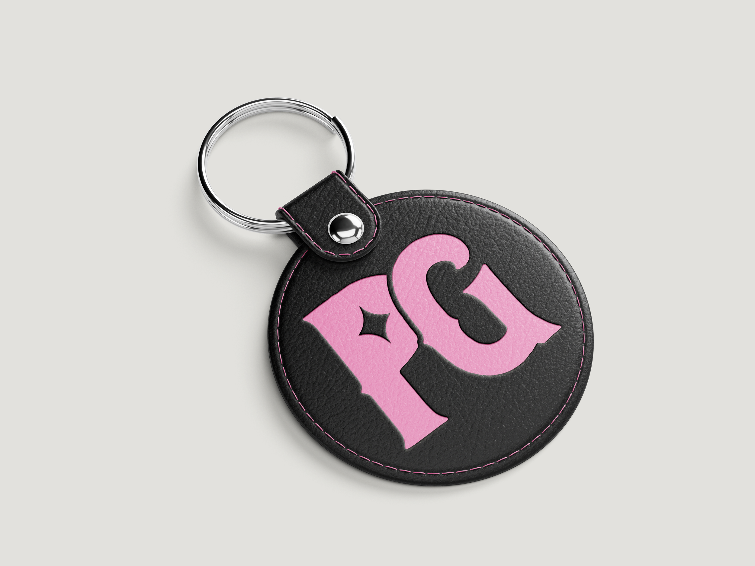
Beginning with the logo, I aimed to preserve the essence of the original art while giving it a more intricate, layered appearance.
I started by adding more depth and dimensionality to the design, elevating it from a generic logo to a more personalized one, while also giving the typography a more eye-catching quality.
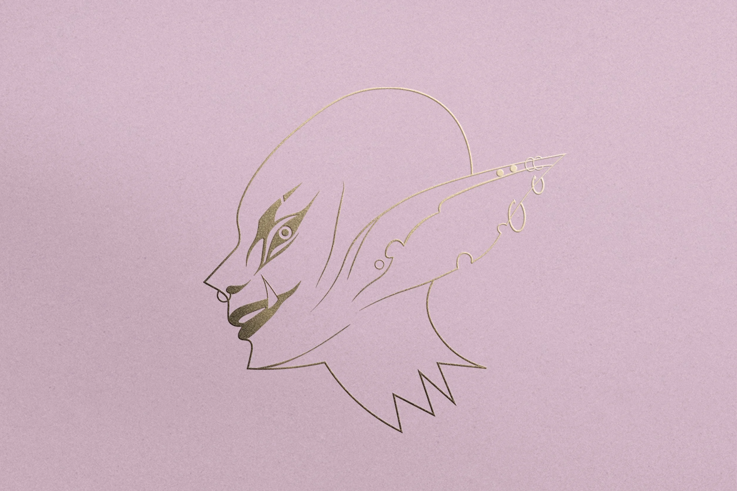
Preserving the History
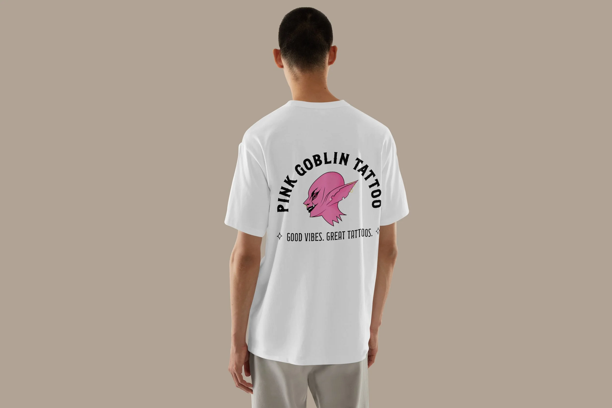
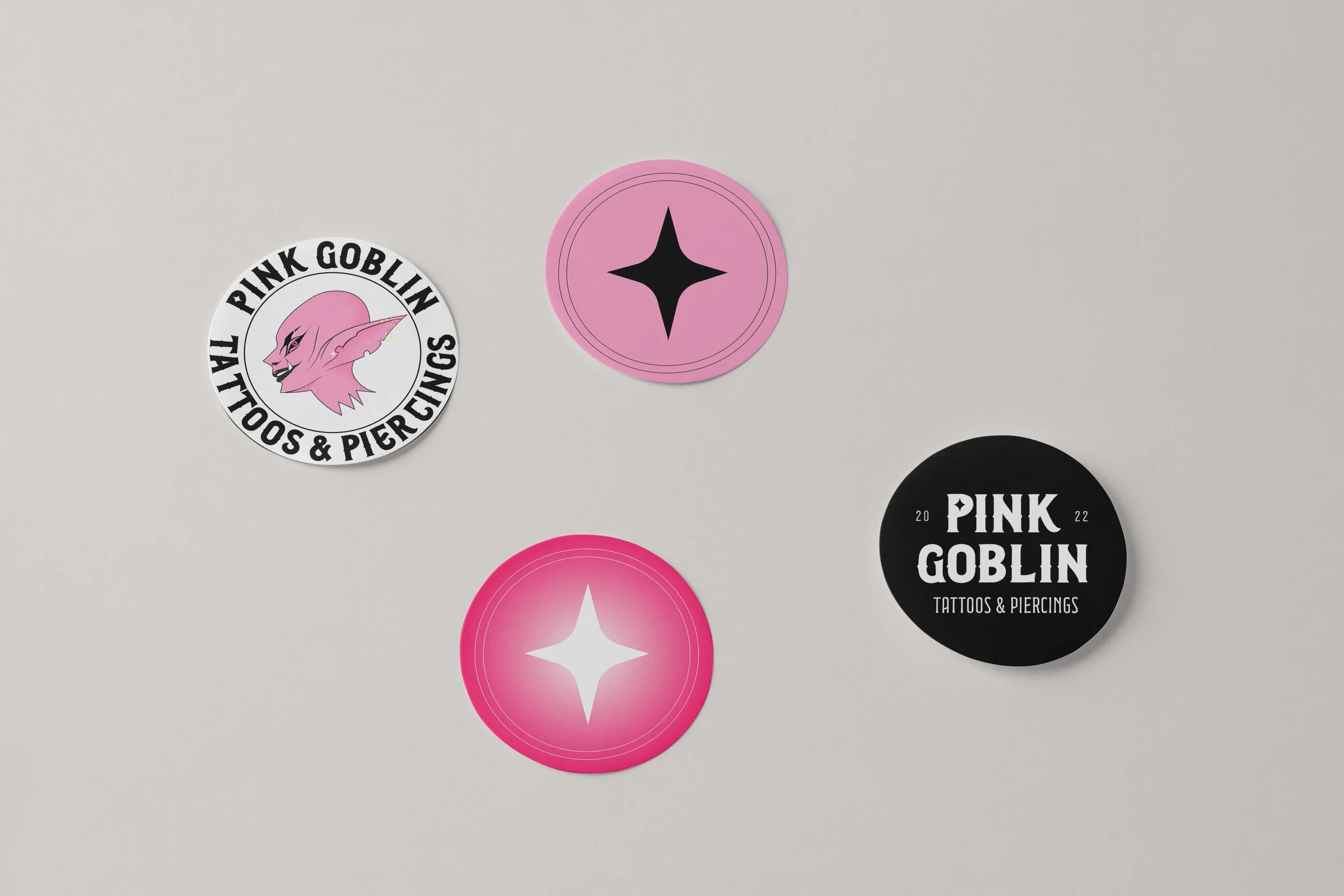
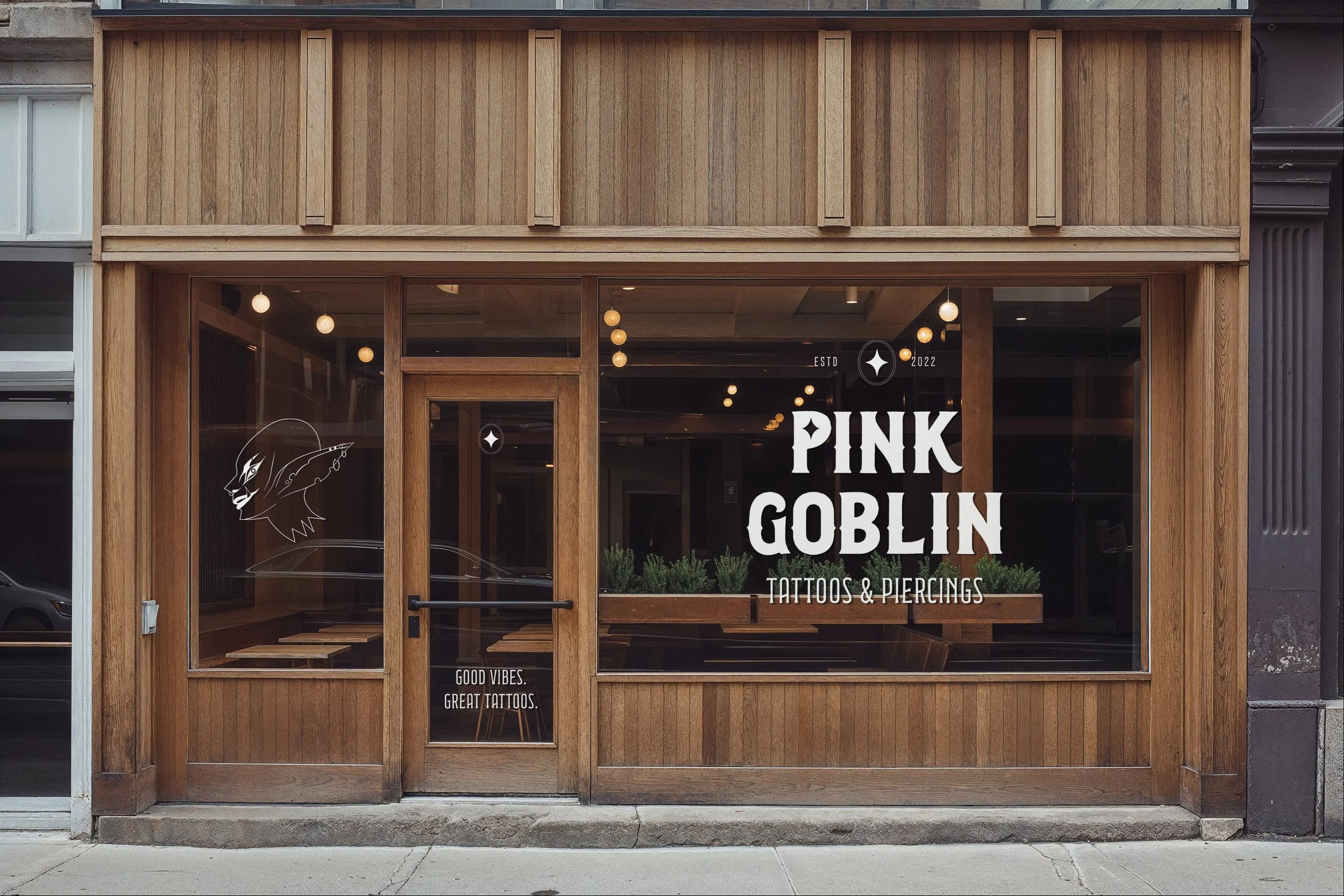
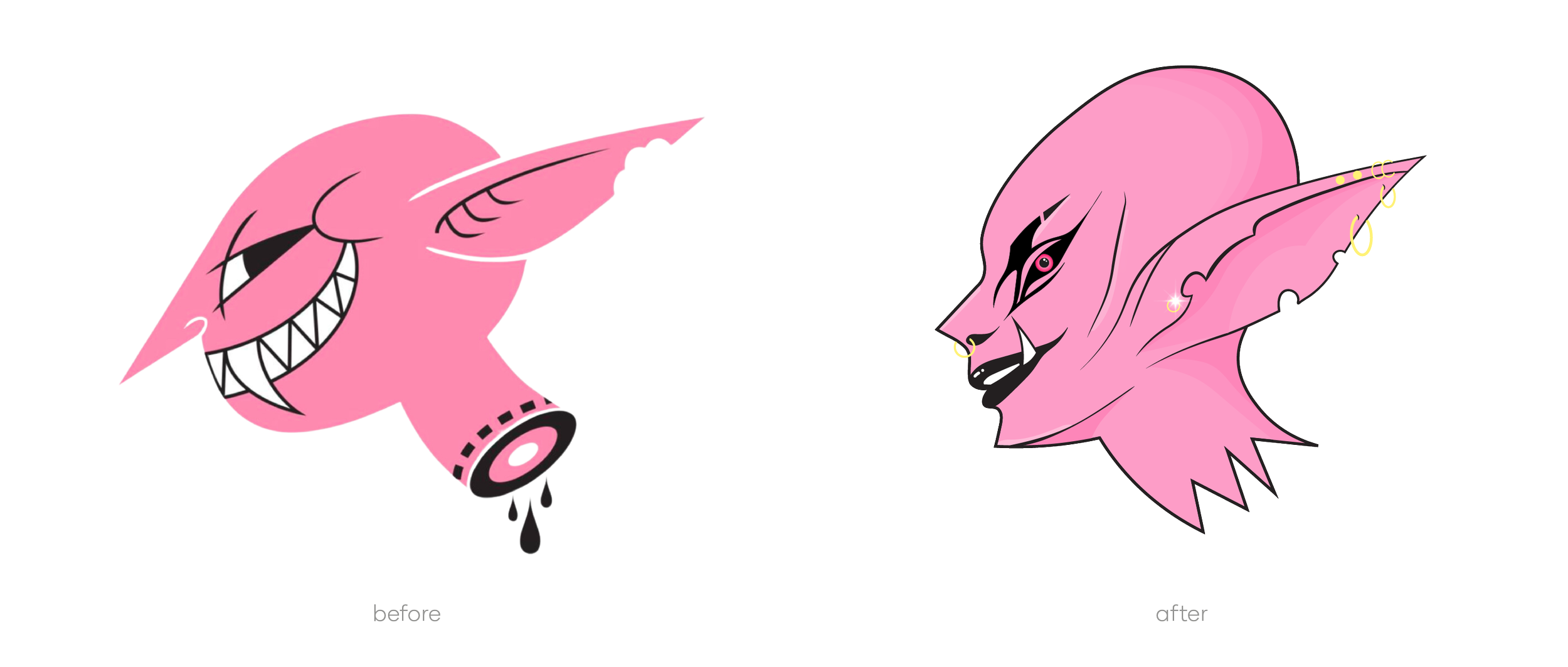
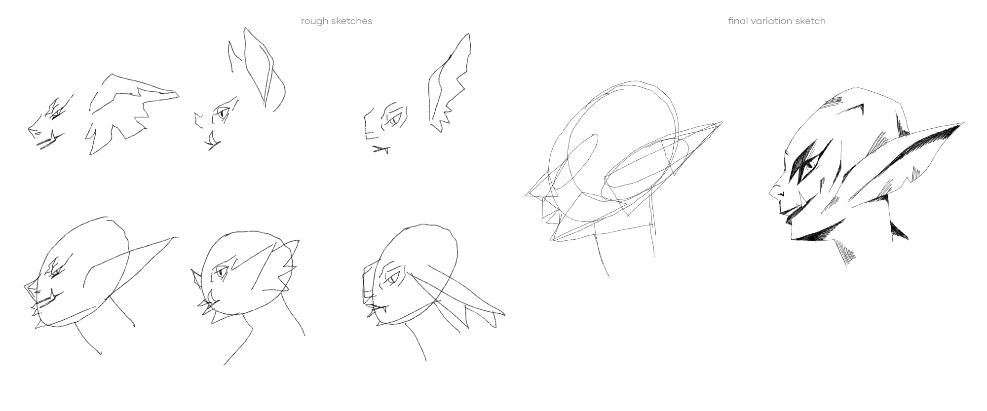
As a female-owned studio focused on inclusivity and creativity, Pink Goblin’s original logo was already strong. Rather than a complete overhaul, I focused on redesigning the goblin character in my own style, adding piercings to subtly showcase their services. The updated logo retains its original structure and cheeky charm while further emphasizing the inclusive, female-founded nature of the studio.

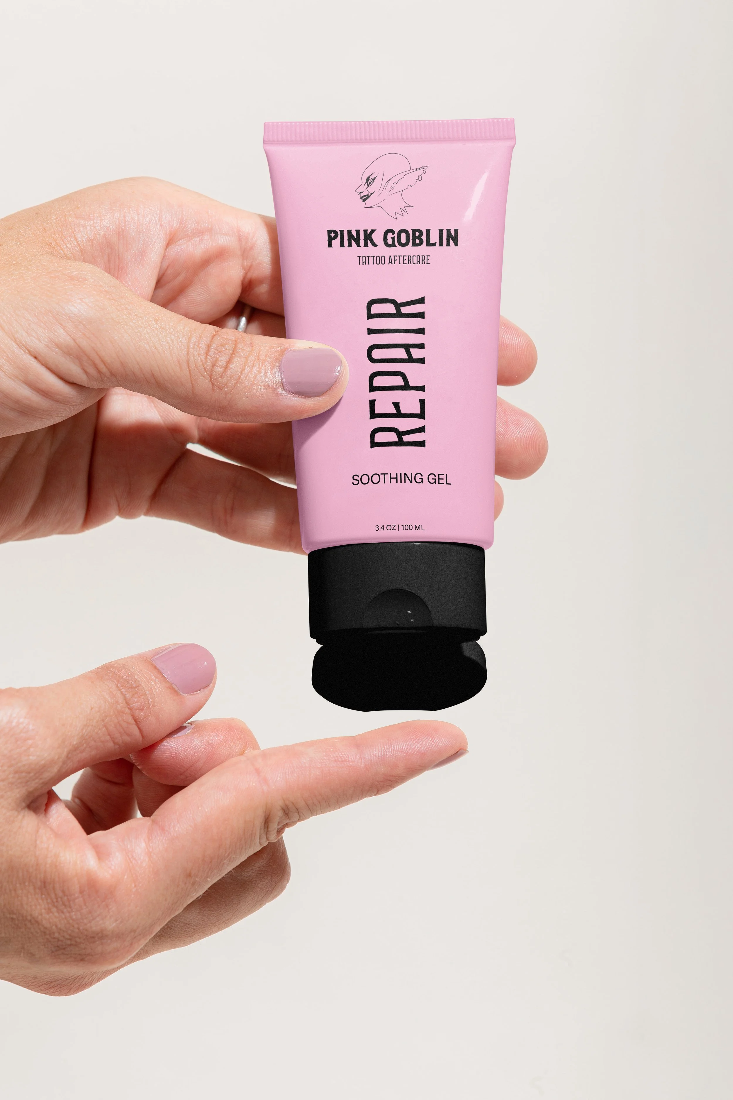
The final design is both visually striking and perfectly aligned with the studio’s values and inclusive vibe. The updated font better reflects their services, while a more robust color palette and versatile logo variations ensure broader usability.
This redesign demonstrates how a logo can reflect a brand’s identity and core values while shining artistically.